Visualization
SocNetV supports three kinds of network visualizations: Prominence-based Placement, Force-Directed Placement, and Ego-Centered Radial Layout, each offering various layout algorithms.
You can select visualizations from the menu “Layout” or by clicking on the checkboxes on the left dock.
Prominence-based Placement
SocNetV implements algorithms that layout the network such that each node’s position reflects its centrality or prestige status within the network.
These algorithms support all prominence (Centrality and Prestige) measures and a variety of layout types: circular, level, nodal size, and color. To apply, choose a prominence index and a layout type from the left dock and press the Apply button.
Please note that these algorithms are used purely for visual representation based on node prominence; they do not optimize for edge crossings.
Circular Layout
In this layout, all nodes are arranged on concentric circles with varying radii. Nodes with higher centrality or prestige are positioned closer to the center of the screen.
When to Use:
- The circular layout is best when you want to emphasize the relative importance of nodes based on their centrality or prestige. This is especially useful for comparing nodes in terms of their prominence in the network.
On Levels Layout
In this layout type, nodes are positioned on levels of varying height. More central nodes will appear at the top of the screen, while less central nodes are positioned lower.
When to Use:
- The “on levels” layout works well when you need to emphasize the hierarchical relationship between nodes, especially when the network structure is tree-like or when you want to visually distinguish between higher and lower centrality nodes.
Nodal Size Layout
In this layout, the size of each node is scaled according to its centrality or prestige score. This layout can be applied in combination with either circular or level layouts for more meaningful visualizations.
When to Use:
- Nodal size is ideal when you want to show the importance of nodes not just by position, but also by their relative size. This is useful for visualizing the absolute “weight” or “influence” of nodes in the network.
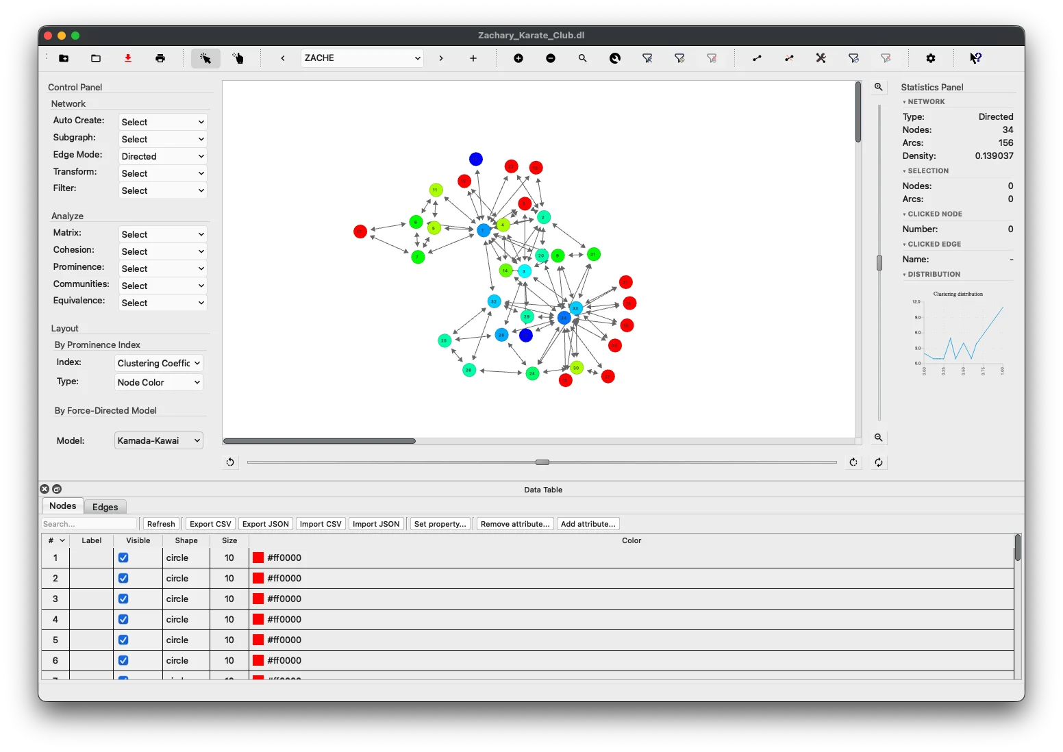
Node Color Gradient Layout
In this layout, each node’s color encodes its prominence score using a continuous blue → red gradient: nodes with lower scores are colored blue, and nodes with higher scores are colored red (warmer). The gradient makes it immediately obvious which nodes score highest without changing their positions.
The layout is available for all 13 prominence indices:
| Index | Shortcut |
|---|---|
| Degree Centrality | Ctrl+L, Ctrl+C, Ctrl+D |
| Closeness Centrality | Ctrl+L, Ctrl+C, Ctrl+C |
| IR Closeness Centrality | Ctrl+L, Ctrl+C, Ctrl+I |
| Betweenness Centrality | Ctrl+L, Ctrl+C, Ctrl+B |
| Stress Centrality | Ctrl+L, Ctrl+C, Ctrl+S |
| Eccentricity Centrality | Ctrl+L, Ctrl+C, Ctrl+E |
| Power Centrality | Ctrl+L, Ctrl+C, Ctrl+P |
| Information Centrality | Ctrl+L, Ctrl+C, Ctrl+F |
| Eigenvector Centrality | Ctrl+L, Ctrl+C, Ctrl+X |
| Degree Prestige | Ctrl+L, Ctrl+C, Ctrl+A |
| PageRank Prestige | Ctrl+L, Ctrl+C, Ctrl+R |
| Proximity Prestige | Ctrl+L, Ctrl+C, Ctrl+O |
| Clustering Coefficient | Ctrl+L, Ctrl+C, Ctrl+G |
Node Color by Clustering Coefficient
Coloring by Clustering Coefficient gives an immediate visual read of how tightly each node’s neighborhood is connected. Highly clustered nodes (close to 1) appear red; nodes with no closed triangles among their neighbors appear blue.
If the Clustering Coefficient has not been computed yet, applying this layout triggers the computation automatically. The result also appears in the distribution chart (Statistics Panel → DISTRIBUTION), the Filter Nodes by Centrality dialog, and the analysis prominence combo in the Control Panel — identical integration to all other centrality indices.
How to apply:
- Menu: Layout → Node Color → Clustering Coefficient (
Ctrl+L, Ctrl+C, Ctrl+G) - Control Panel: select Clustering Coefficient in the Prominence Index combo, then set Type to Node Color.
When to Use:
- Quickly spot structurally embedded nodes (high CLC, red) versus bridge nodes or isolates (low CLC, blue).
- Combine with the Ego Radial Layout or Ego Network filter to zoom into the neighborhood of a high-CLC node.
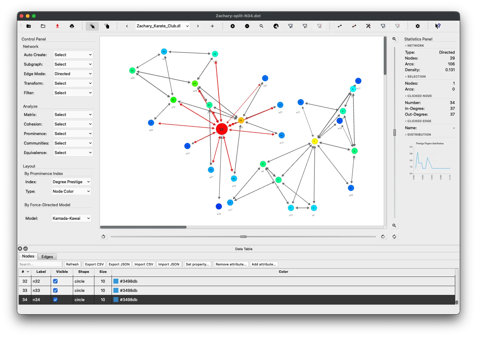
Node Color by Connected Component
Coloring by Connected Component makes disconnected sub-networks immediately visible. Every node in the same weakly connected component shares the same palette color; nodes in different components get different colors (up to 15 distinct palette colors; the palette cycles for networks with more components).
How to apply:
- Menu: Layout → Node Color → Connected Component (
Ctrl+L, Ctrl+C, Ctrl+0)
If the network is fully connected, the action reports “one component” and leaves colors unchanged. Both directed and undirected networks are supported — weak connectivity is used throughout (edge directions are ignored), consistent with Gephi, igraph, and NetworkX defaults.
When to Use:
- Instantly identify how many isolated sub-networks are present in a disconnected graph.
- Combine with Analyze → Cohesion → Connectedness which also reports the component count.
Force-directed Placement
Kamada-Kawai Layout
The Kamada-Kawai model treats the network as a dynamic system where every two actors are ‘particles’ connected by ‘springs’. Each spring has a desirable length corresponding to their graph-theoretic distance.
The optimal layout occurs when the system’s imbalance is minimized. The imbalance is calculated as the total spring energy:
Where:
- is the actual distance between nodes and ,
- is the ideal spring length between nodes and .
Initially, nodes are placed on the vertices of a regular n-polygon.
When to Use: Kamada-Kawai is ideal when you need to preserve the relative distances between nodes in a graph. It is well-suited for visualizing network structures where you want to maintain meaningful distances and relationships between nodes, especially in dense graphs.
Spring Embedder Layout
The Spring Embedder model (Eades, 1984) replaces nodes with steel rings and edges with springs, forming a mechanical system. The vertices are initially placed in some layout and allowed to move to achieve a minimal energy state. As Eades described:
“The basic idea is as follows. To embed [lay out] a graph, we replace the vertices by steel rings and replace each edge with a spring to form a mechanical system… The vertices are placed in some initial layout and let go so that the spring forces on the rings move the system to a minimal energy state.”
In our implementation, each node exerts a repelling force on all other nodes, while each edge acts as a spring exerting an attractive force between the connected nodes.
The attractive force is calculated as:
Where:
- is the Euclidean distance between nodes and ,
- is a constant (set to 2),
- is the “natural length” of the spring, calculated as:
The repelling force between any pair of nodes is computed using:
Where .
These forces are applied iteratively, adjusting node positions until equilibrium is reached, meaning that the node positions no longer change.
Note: Repulsive forces are calculated between every pair of vertices, while attractive forces only act between directly connected nodes.
When to Use:
The Spring Embedder layout is suitable for graphs that are less dense, and when you want to visually separate nodes while preserving the network’s connectivity. This layout is particularly useful for illustrating connections in networks where you want to emphasize node relationships and forces between connected nodes.
Fruchterman-Reingold Layout
The Fruchterman-Reingold model (1991) builds upon the Spring Embedder model by introducing the analogy of nodes as electrically charged or gravitational bodies. Nodes repel each other, while connected nodes attract each other.
As described by Fruchterman and Reingold:
“Consider the following analogy: the vertices behave as atomic particles or celestial bodies, exerting attractive and repulsive forces on one another; the forces induce movement. Our algorithm resembles molecular or planetary simulations, sometimes called n-body problems.”
In this layout, the forces are computed as follows:
- Attractive Force:
- Repulsive Force:
Where the optimal distance is defined as:
Repulsive forces are computed for all vertices, while attractive forces are only computed between neighboring vertices.
When to Use:
This layout is well-suited for networks with clear clusters or community structures. It works well when you need to emphasize node-to-node interaction and provide a clear visual of these interactions, especially when the network has a mix of dense and sparse regions.
Ego-Centered Radial Layout
The Ego Radial Layout is designed for focused exploration of large networks. It places a single selected node (the ego) at the canvas center and arranges all other nodes in two concentric rings based on their relationship to the ego.
Ring Structure
| Ring | Contents | Radius |
|---|---|---|
| Inner | Ego’s 1-hop out-neighbors | 35% of max canvas radius |
| Outer | All remaining enabled nodes | 75% of max canvas radius |
Guide circles are drawn on the canvas to mark each ring boundary.
Directed vs. Undirected Networks
In directed networks, only nodes reachable via the ego’s out-edges appear on the inner ring. Nodes that point to the ego but are not pointed to by it appear on the outer ring.
In undirected networks, all adjacent nodes appear on the inner ring.
How to Apply
- Select one node on the canvas, then choose
Layout→Ego Radial Layout, or pressCtrl+Alt+E. - Right-click any node and select
Ego Radial Layoutfrom the context menu (no prior selection needed).
When to Use:
The Ego Radial Layout is ideal when you want to:
- Inspect the immediate neighborhood of a specific node in a large network.
- Visually separate a node’s direct connections from the rest of the graph.
- Combine with the Ego Network filter (
Edit→Filter Nodes→Ego Network) to hide all non-neighborhood nodes entirely.